- Solutions
-
- File Server: Ransomware Protection
- File Server: File Copy
- File Server: Audit File Access
- File Server: Storage growth reporting
- Licensing/Pricing
- Contact
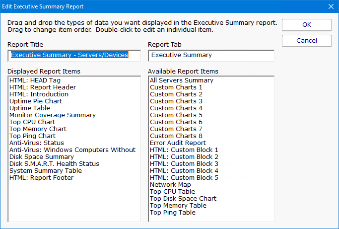
By right clicking a group and going to Report Settings -> Group Settings you will see three Custom Group reports and an Executive Summary report. They both allow you to add your own fields, charts and custom HTML blocks to the report to customize it to your needs.

A variety of report parts can be chosen. Some are pre-built charts while others let you specify counters that should be charted. To add a report part, drag the part from the right side and drop it on the left side. Double-click the report part on the left side to set parameters for that part.
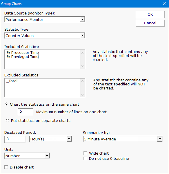
Most of the report parts are self-explanatory. The Custom Charts parts are more complex and powerful and deserve some explanation.

The top box labeled Included Counters is where you will specify which counters should be charted. Any counter that contains text from any line in that box will be selected for charting. Since this is a group-level report, the statistic also has to come from a server within the group or sub-groups.
If you need to exclude a particular counter, you can enter some text and if that text is found in the counter name, that counter will be excluded.
For example, imagine you have the following counters:
To show processor time for CPUs 0 and 1, but not for _Total, you would use:
Included Counters: % Processor Time
Excluded Counters: _Total
Once counters are specified, you need to choose how they should be displayed. If there are many servers in the group, the number of matching counters might be large, so there are simple settings to help you control the layout, how many charts are created, how many statistics are combined onto one chart, etc.
The Wide Chart setting will create a chart that is the full width of the report, instead of the smaller default chart size.
The y-axis on most charts starts at 0, but you can indicate the y-axis minimum value should be dynamically computed based on the data to be displayed. Sometimes this makes changes in large values easier to see.
If the chart is disabled, it won't be shown, but will be left as part of the report for future editing.